Drawable是什么
一种可以在Canvas上进行绘制的抽象的概念
颜色、图片等都可以是一个Drawable
Drawable可以通过XML定义,或者通过代码创建
Android中Drawable是一个抽象类,每个具体的Drawable都是其子类
优点:
- 使用简单,比自定义View成本低
- 非图片类的Drawable所占空间小,能减小apk大小
Drawable的内部宽/高
一般getIntrinsicWidth/Height能获得内部宽/高
图片Drawable其内部宽高就是图片的宽高
颜色Drawable没有内部宽高的概念
内部宽高不等同于它的大小,一般Drawable没有大小概念(作为View背景时,会被拉伸至View的大小)
分类
可见有很多种类,我们只需要了解几种常用的即可。
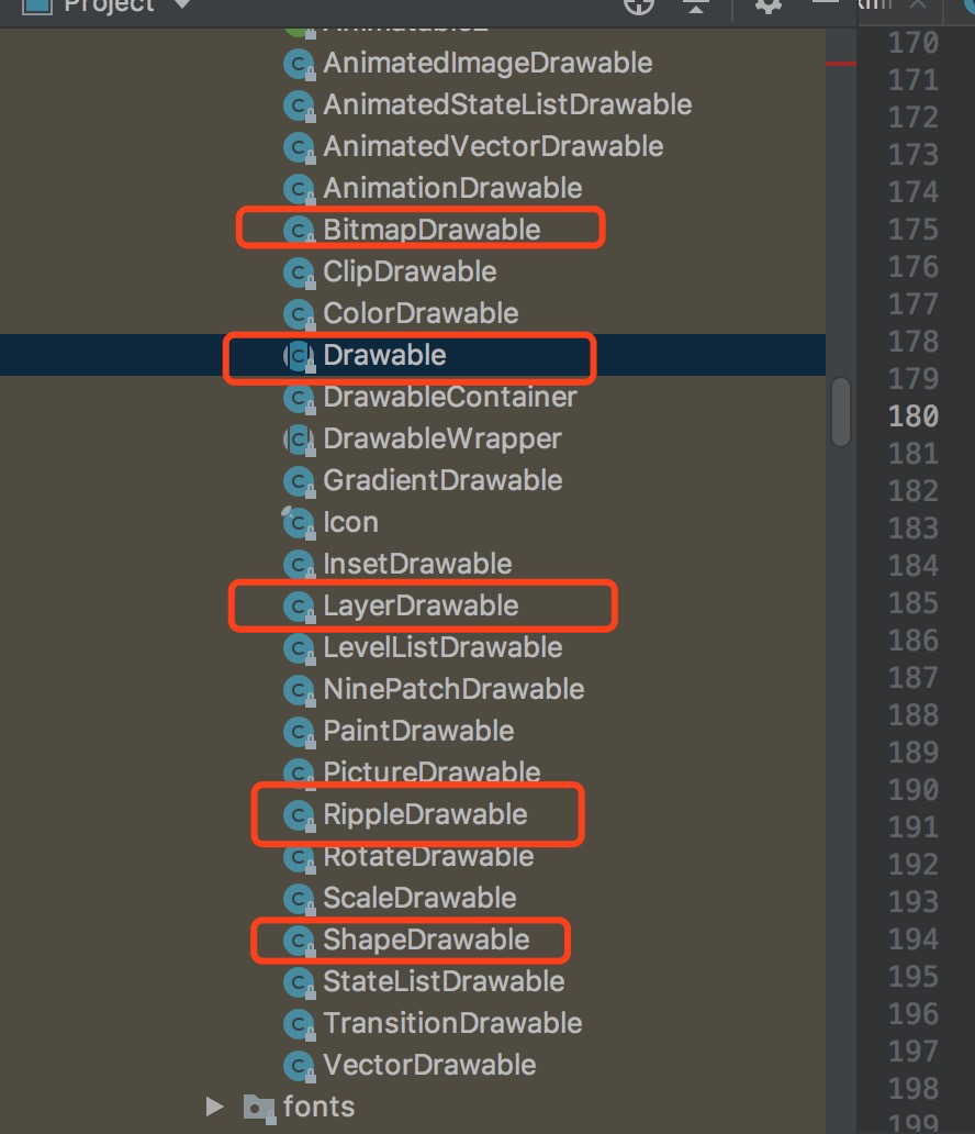
常用分类
BitmapDrawable的作用和使用
表示一种图片,可以直接引用原始图片或者通过XML进行描述
1 |
|
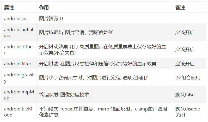
属性:
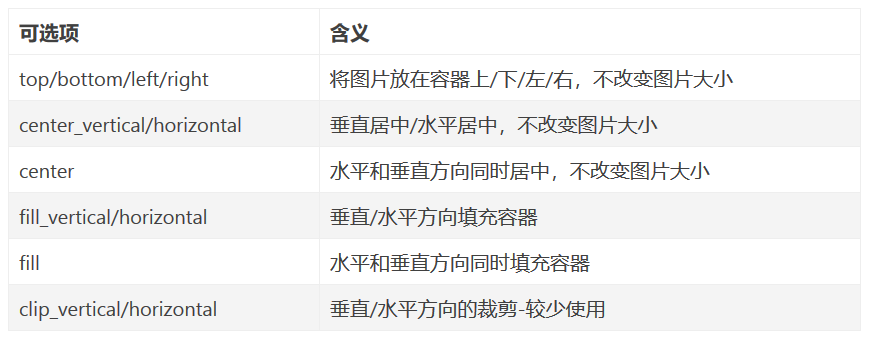
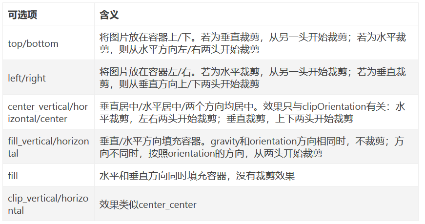
gravity属性详情
NinePatchDrawable(.9图片)的作用
- 自动根据宽高进行缩放且不会失真
- 实际使用,可以直接引用图片或者通过XML描述
1 |
|
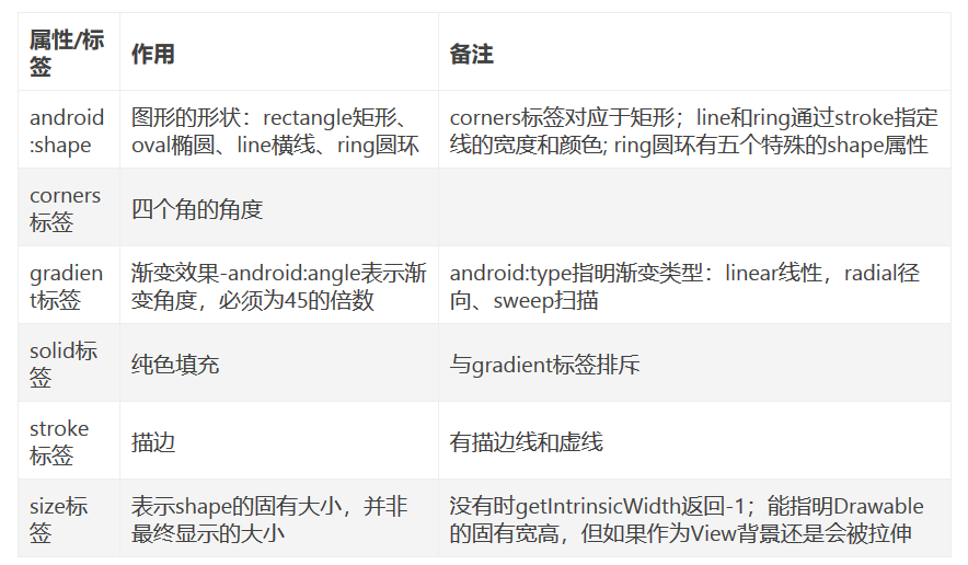
ShapeDrawable的作用
- 通过颜色构造的图形
- 可以是纯色的图形
- 也可以是有渐变效果的图形
- shape标签创建的Drawable实体是GradientDrawable
1 |
|
ShapeDrawable的属性介绍
LayerDrawable的作用
XML标签为layer-list
层次化的Drawable合集
可以包含多个item,每个item表示一个Drawable
item中可以通过android:drawable直接引用资源
android:top等表示Drawable相当于View上下左右的偏移量
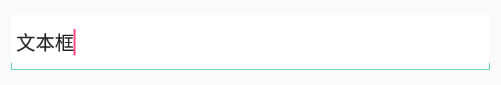
微信文本输入框
在drawable目录下创建一个layer_list.xml
1 |
|
在布局中使用
1 | <EditText |
效果
StateListDrawable的使用和要点
- 对应于selector标签
- 用于View根据状态选择不同的Drawable
1 |
|
LevelListDrawable的作用
对应于level-list标签
拥有多个item,每个item都有maxLevel和minLevel
Level的范围为0~10000
给定level后,会按从上至下的顺序匹配,直到找到范围合适的Drawable,并返回
item的level一定要降序或者升序
调用View的getBackground获得Drawable对象,并调用setLevel设置等级level
ImageView的setImageLevel()能快速指定src引用的Drawable的Level
LevelListDrawable是根据level改变,选择不同的Drawable,能用于实现进度条、音量调节等等
1 |
|
TransitionDrawable的作用
对应于transition标签
实现两个Drawable之间的淡入淡出效果
获得背景的TransitionDrawable后,通过startTransition和reverseTransition方法实现效果和逆过程
1 |
|
InsetDrawable的作用和使用
- 对应inset标签
- 将其他Drawable内嵌到自身,并在四周留出间距
- View需要背景比自己实际区域要小的时候,可以使用inset,layer-list也可以实现该需求
1 | <inset xmlns:android="http://schemas.android.com/apk/res/android" |
ScaleDrawable的作用
对应于scale标签
根据自己的等级level(0~10000)将指定的Drawable缩放到一定比例
android:scaleHeight=”70%”用于指定宽高的缩放比例=为原来的30%
ScaleDrawable的level为0,不可见。为10000时,不缩放。
一般将level设置为1,就会按照属性指定的比例缩放。其他值也会改变缩放效果。
android:scaleGravity属性和gravity属性完全一致
1 | <scale xmlns:android="http://schemas.android.com/apk/res/android" |
ClipDrawable的作用
对应于clip标签
根据自己当前的等级level(0~10000)来裁剪另一个Drawable
裁剪方向由clipOrientation和gravity属性共同控制
level为0,Drawable不可见;10000表示不裁剪;为8000,表示裁减了2000;为1,表示裁剪了9999
ClipDrawable的gravity
AnimationDrawable的作用
对应于animation-list标签
用于实现逐帧动画效果
android:oneShot决定是循环播放还是播放一次,false:循环播放
item中设置一帧一帧的Drawable以及持续时间
AnimationDrawable的setOneShot(boolean flag) 和android:oneShot配置一样
addFrame (Drawable frame, int duration) 动态的添加一个图片进入该动画中
stop()和start()用于停止和开始/继续播放,停止时会停留在当前一帧上
1 |
|
在代码中定义出AnimationDrawable对象,并设置到view的background上,然后设置开始播放就可以
1 | val animationDrawable = resources.getDrawable(R.drawable.animationdrawable) as AnimationDrawable |
ShapeDrawable的OvalShape、RectShape、ArcShape和PaintDrawable的作用和使用
1.用于获得有shape形状的drawable(椭圆、长方形、扇形以及更为通用PaintDrawable-具有圆角和边界)
1 | * 一个继承自ShapeDrawable更为通用的Drawable:具有圆角 |
自定义Drawable
概况
- 一般作为ImageView的图像来显示
- 另一个是作为View的背景
- 自定义Drawable主要就是实现draw方法
- setAlpha、setColorFilter、getOpacity也需要重写,但是模板固定
- 当自定义Drawable有固定大小时(比如绘制一张图片),需要重写getIntrinsicWidth()/getIntrinsicHeight()方法(默认返回-1),会影响到View的wrap_content布局
- 内部固定大小不等于Drawable的实际区域大小,getBounds能获得实际区域大小
自定义Drawable模板代码
1 | class CustomDrawable(color: Int) : Drawable(){ |
SVG矢量图
SVG?
- 可伸缩矢量图(Android 5.0推出)
- 定义用于网络的基于矢量的图形(在Web上应用非常广泛)
- 使用XML格式定义图形
- 图像缩放不会影响质量
- 万维网联盟标准(与DOM和XSL之类的W3C标准是一个整体)
SVG和Bitmap的区别
- SVG是一个绘图标准。
- Bitmap是通过每个像素点上存储色彩信息来表示图像。
- SVG放大不会失真, Bitmap会失真。
- Bitmap需要为不同分辨率设计多套图表,SVG绘制一张图就能适配不同分辨率。
静态矢量图SVG-VectorDrawable
- 基于XML的静态矢量图
- 采用标签vector
- vector中path是最小单位,创建SVG-用指令绘制SVG图形
- vector中group将不同path组合起来
VectorDrawable的vector标签有哪些属性
1 | <vector xmlns:android="http://schemas.android.com/apk/res/android" |
VectorDrawable的path标签的全部指令
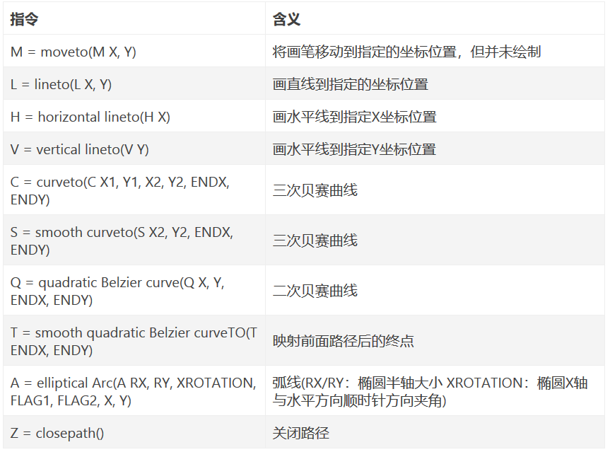
- 坐标轴以(0, 0)为中心, X轴水平向右, Y轴水平向下
- 指令大写-绝对定位,参考全局坐标系;指令小写-相对定位,参考父容器坐标系
- 指令和数据间空格可以省略
- 同一指令出现多次,可以只用一个。
- A的参数:RX/RY:椭圆半轴大小 XROTATION:椭圆X轴与水平方向顺时针方向夹角 FLAG1:1-大角度弧线 0-小角度弧线 FLAG2:起点到终点的方向,1-顺时针,2-逆时针 X/Y:终点坐标
VectorDrawable实例
1 | //1. 使用`vector`标签定义矢量图VectorDrawable(ic_black_24dp.xml) |
矢量图动画-AnimatedVectorDrawable
AnimatedVectorDrawable的作用是给VectorDrawable提供动画效果,Google的工程师将AnimatedVectorDrawable比喻一个胶水,通过AnimatedVectorDrawable来连接静态的VectorDrawable和动态的objectAnimator。
- 针对静态矢量图-VectorDrawable来做动画
- xml标签为animated-vector
- 在target子标签下指明VectorDrawable的名字(都是android:name=”…”属性指明),并指定动画效果android:animation=”@animator/…”
- AnimatedVectorDrawable中指明的target和name属性,必须与VectorDrawable中需要的name保持一致,这样系统能找到找到要实现的动画元素
1 | //1. 静态矢量图-VectorDrawable(vector_two_line.xml) |
开启动画
1 | val drawable = imageview.drawable |